
How To Create Chart In Excel From Table : Hello Friends, If you are here thats mean you want to learn To Create Chart In Excel. In this guide i will teach you How To Create Chart In Excel From Table and types of chart.
I’ve tried many times and made lots of different graphs and charts in Excel that look really professional. What I learned is that having a clear plan makes things easier. Now, I always use the same step-by-step method when making charts in Excel.
To help you do the same, I’ve created a simple, step-by-step guide to make great charts and graphs in Excel. If you follow it, you’ll get really good at it, and it will feel easy and natural.
What is Graph or Chart in Excel
An Excel chart or graph is a picture that shows data from a Microsoft Excel sheet. These pictures help you spot trends, compare things, find patterns, and understand the numbers better. Excel offers many types of charts and graphs, like bar charts, line charts, and pie charts.
How To Create Chart In Excel From Table
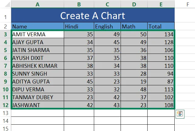
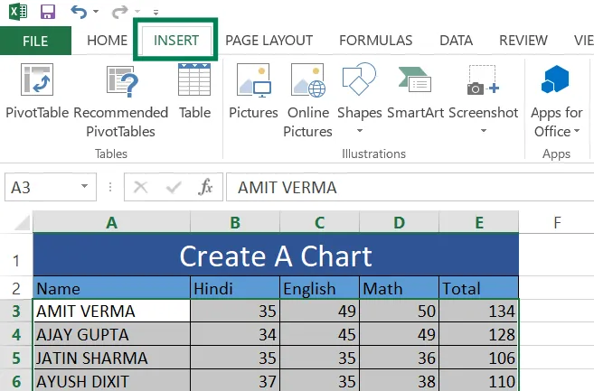
Step 1: Put your data in a table with clear column titles. Click and drag to highlight the data and titles you want in the chart.
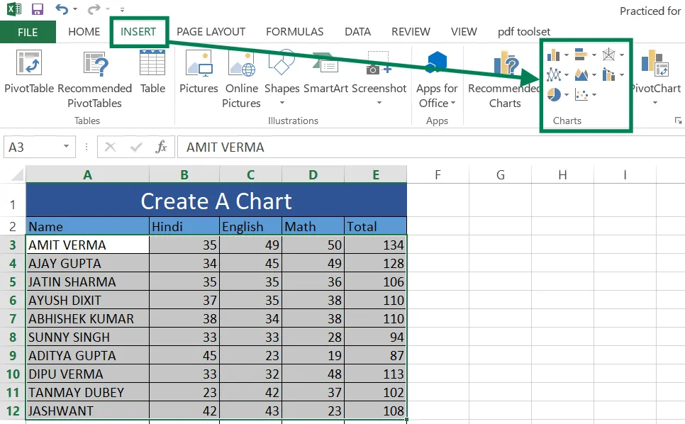
Step 2: Click the Insert tab at the top of Excel.
Step 3: In the Charts section, pick the chart type you need:
- Column/Bar Chart: For comparing different items.
- Line Chart: For showing changes over time.
- Pie Chart: For showing parts of a whole.
- Scatter Plot: For showing relationships between two things.
- Other options like Area or Radar charts are also available.
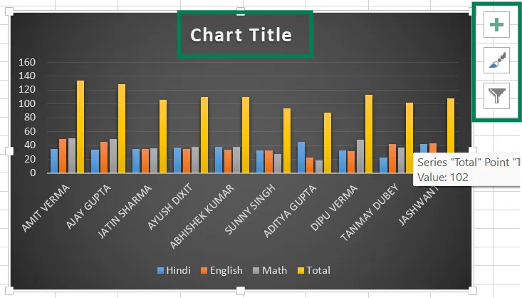
Step 4: After creating the chart, you can customize it:
- Chart Style: Use the paintbrush icon to change colors or styles.
- Chart Title: Click the title to edit it.
- Axis Titles: Use the + icon to add or edit axis labels.
- Data Labels: Turn on data labels to show numbers on the chart.
If you update the data in your table, the chart will automatically update too.
Types Of Chart In Excel
1. Column Chart
A column chart, also called a clustered column chart, is used to easily compare values between different groups or categories.
2. Bar Chart
A clustered bar chart is a type of bar chart. Use this chart when you want to compare values across different categories, especially if the chart shows time periods or if the category names are long.
3. Surface Or Radar Chart
Radar charts show the total value of many different groups of data in one picture.
4. Line Chart
Use this type of chart to display how things change over time (like years, months, or days) or to compare different groups or categories.
5. Area Chart
Use this type of chart to display how things change over time (like years, months, or days) or across different categories. It helps to show how much something has increased or decreased over a period.
6. Combo Chart
Use this type of chart to show different kinds of information. It works best when the values in the chart are very different from each other or when you have a mix of data types.
7. Pie Or Doughnut Chart
Use this type of chart to show how parts make up a whole. It works best when the numbers you’re using add up to 100%.
8. Scatter Or Bubble Chart
Use this type of chart to display how different groups of numbers are connected or related to each other.
Also Read: How To Create A Pivot Table In Excel Sheet
Use Of Chart In Excel
Charts in Excel are helpful tools that turn numbers into pictures, making data easier to understand and share. Here’s how they can be used:
- Showing Data Visually
Charts turn numbers into bars, lines, or pie slices, so you can see patterns and trends quickly. For example, a line chart can show if sales are going up or down over time. - Comparing Data
Charts let you compare different sets of data, like sales in different cities. A bar chart, for instance, can show which city has the highest sales. - Finding Trends
Charts help you see if something is increasing, decreasing, or staying the same over time. A line chart can show if your monthly income is growing. - Showing Relationships
Charts can show how two things are connected. For example, a scatter plot can show if spending more on ads leads to more sales. - Simplifying Data
Charts make large or complicated data easier to understand. A pie chart, for example, can show how your budget is divided. - Making Decisions
Charts help you make better choices by presenting data clearly. A dashboard with charts can help you plan business strategies. - Improving Reports
Charts make reports and presentations more interesting and clear. A bar chart in a report can highlight important numbers. - Spotting Unusual Data
Charts can help you find data that doesn’t fit the usual pattern. A scatter plot can show points that stand out. - Tracking Goals
Charts help you see how close you are to reaching a goal. A bar chart can show how much of your yearly sales target you’ve achieved. - Customizing Charts
Excel lets you choose from many chart types, like bar, line, or pie, and adjust them to fit your needs.
Also Read: How To Create Barcode In Excel
Conclusion:
To sum up, making a chart in Excel is an easy way to show data in a clear way. You just need to pick the right chart, add correct data, and change the design to make it look better. Excel has many charts, like bar graphs and pie charts, so you can choose what fits your needs.
With practice, you can add labels, colors, and styles to make your chart look more professional. Learning this skill will help you show data better and make smart choices. Try using Excel charts today to improve how you display information!
Thank you for reading this article till the end.